All this time I’ve been under this misconception that I am a terrible client to work with…like many clients, I didn’t know what I wanted in my brand. I didn’t know what colors I wanted to have represent myself, what typefaces that should be used, what visuals to use to convert my message; basically what kind of designer I wanted the world to see when they looked at my logo. At my brand.
For 4 years I struggled to come up with a logo design that “Kelsey the Client” would like, and every single thing I did was simply never good enough. You see, “Kelsey the Client”, had a vision of awesomeness that she had a hard time conveying and communicating to “Kelsey the Designer”. For 4 years we both struggled with disappointment, let downs, and pure hatred for the many attempts “Kelsey the Designer” made at a logo. Our logo.
As time went on, I was scared that I would not have a brand before graduation; “Kelsey the Client” was furious at all the deadlines that “Kelsey the Designer” kept missing. Let’s just say that designing your brand for yourself is a bit of a battle that every designer enters and fights to the death. For me, I was having an identity crisis. If you asked me what my favorite color was, I would be unable to tell you…because I like them ALL. But a rainbow logo simply would not do (yes for the obvious reasons, I support but am plain-boring-straight white gringa). By the way in case you were wondering, my most favorite of all of the colors (known to man) is blue. But blue wouldn’t cut it for Kelsey the Client. She’d seen too many blue logos and besides that, couldn’t decide on the perfect shade of blue. Robin’s Egg, or turquoise? Cerulean or indigo? Navy or aqua blue? TOO MANY CHOICES AND DECISIONS TO BE MADE!! (Yes there is a reason to why I am telling you this frivolous piece of information).
As all good designers know, colors have meaning to them… or they represent some other idea they wish to convey to the consumer. If you use blue, you are calm (which I am not), blissful, peaceful like the ocean. If you go with an orange you are energetic and warm. Red is passionate, romantic, or even angry. The list goes on and on…AND ON. So this is why I had an extremely difficult time choosing a color scheme. What do I wish to convey to the viewer? This is a question I have asked myself for weeks…months…about 2 years, let’s be honest with each other.
Let’s move to typefaces. There are 1000’s upon 1000’s of books written about typefaces and what adjective they represent. Real quick: script is feminine, elegant, and sophisticated (as can be seen in 80% of all wedding invitations (I made that statistic up)). San serif (no serif) is clean, modern, smart, and says to the world “Ain’t nobody got time for serifs!”. This category of typeface can be seen in brands like Apple, Microsoft, T-Mobile, Nissan, Pepsi, and the list goes on; you get my point. Serif typefaces are traditional, elegant (think Vogue), reliable, luxurious, old school, new school, etc. You really can do no wrong with a serif (unless it’s Time’s New Roman…seriously Mom, chose a different font on Word!). Then you have decorative (mainly nonsensical fonts that I typically greatly dislike), slab serif (one of my favorites ahem ROCKWELL), geometric, handwritten, the list goes on. Now I ask you, normal human being, how does one goes go about choosing just one to three fonts to represent themselves? Of all the millions of typeface choices in the world, how do you narrow it down to just a few? See my point?
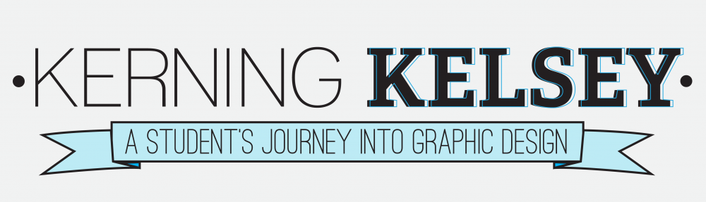
Making these types of decisions is difficult for me. Hence the reason it took me 4 years to finally design a brand that I, A. LOVE, B. don’t want to keep changing to make it even better, C. defend against criticism, D. sigh with a hint of shameful embarrassment, and saved the best for last:: E. make my charity-case client, “Kelsey the Client” extremely and 100% utterly happy.
I did almost all of those things (the minor exception being C…but that’s a story for another time…and I’ll tell it; it’s a good story to tell).
